
Kuto Marketing Site
Problem
The existing Kuto marketing website used outdated design, language, and content that reflected poorly on our brand. Specific issues included:
- Users commented that the site did not effectively communicate the Kuto product value and purpose.
- Difficult site navigation that frustrated users.
- No visibility into security measures and data protection, essential for a financial services provider.
- A lack of pricing and subscription information now that our core business model had shifted.
- Our sales team had recently adopted a remote approach strategy where our website was often the first touchpoint for a potential new business.
Solution
To address these issues, I proposed a complete redesign of the Kuto marketing website. The goals of the redesign were to:
- Establish trust and credibility through clear communication of security features and benefits.
- Improve usability by simplifying navigation and refining page layouts.
- Better showcase Kuto's offerings and value proposition through compelling copy and graphics.
As the sole designer at Kuto, I was responsible for the full design process including wireframing, prototyping, visual design, and frontend development. Specifically, I executed the visual design in Figma and implemented the frontend codebase using React and TypeScript.
ROLE
TOOLS
CLIENT
The Approach
The project was organized into three phases:

As the sole designer while balancing other projects, I was challenged to efficiently execute the research, design, and development phases in order to create a high-quality website within a constrained 6-week timeline. This required me to rapidly incorporate research to establish a focused design direction that could be swiftly implemented given the aggressive schedule.
Research
When conducting research for this website redesign, my focus was on clarifying Kuto's value proposition and messaging. I did this by analyzing customer feedback and app usage, aligning with our sales team to inform business messaging, and exploring competitor sites as well as industry trends to guide the UI design and pricing information.
Customer Feedback
Customer feedback was gathered organically over time, including at in-person gift card giveaway events and through in-app support messages. Key feedback included:

These comments indicated that the messaging surrounding Kuto online did not effectively inform users of the app's purpose, how it works, and why it matters. I realized the stark need to overhaul the messaging and story of our website homepage to address this customer confusion.
App Usage Analysis
My goal was to identify signup sources and engagement drivers through reviewing app usage data and user habits. However, analysis showed consumer benefits needed to be clear incentives, as altruism alone did not drive signups and engagement. I knew establishing these user benefits upfront would be crucial for the consumer homepage design.
Sales Team Interviews
When working with the sales team, my goal was to understand their most effective messaging and persuasion tactics. Key elements included:
- Highlighting no hidden fees to overcome distrust of POS systems.
- Emphasizing acquisition of new customers through Kuto promotions.
- Discussing additional benefits and telling the story of Kuto before bringing up subscription pricing.
These insights directly shaped my design approach, particularly in highlighting Kuto's transparency and benefits on the homepage.
Competitive Analysis
I analyzed competitors websites with the goal of learning how businesses presented their fees as well as pitched their product to businesses. While researching competitors websites, I kept in mind Kuto businesses feedback as well as elements we learned motivated users.

After reviewing the above established competitor websites, I identified the following opportunities: UI/Navigation:
- Clean, focused UI allows key info to stand out, as seen with Venmo
- Burying details created confusion, like Fivestars' hidden pricing Value Prop/Content:
- Gatekeeping content obscures product value, as Square avoided
- Trend toward emotional images of real people over curated graphics
Design
After conducting the above research and defining our core goals for the website, I felt confident in my direction and began the design phase of the initiative.
Information Architecture
Prior to designing the UI for the new website, I reviewed the information architecture of the existing website to analyze issues. This highlighted problems like lack of product info on the homepage and disjointed, confusing content that needed to be addressed.
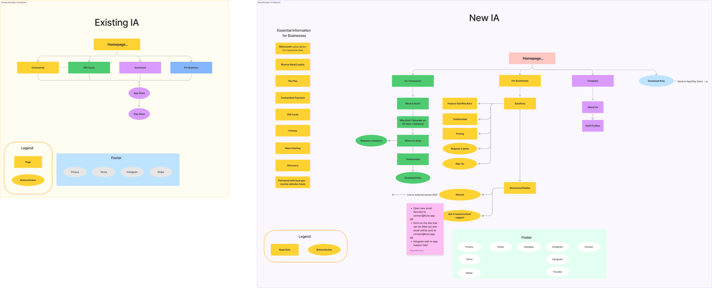
Existing and New Information Architecture Diagrams
For the new IA, I focused on structuring content to clearly convey Kuto's story and value. To optimize this, I created separate consumer and business homepages with tailored information. Content was also organized to provide a logical flow that would compel users. This structure addressed existing issues and provided an ideal foundation for the UI design.
Wireframes
Building off of the IA diagram for the new website, I began the wireframing process. Due to the tight timeline for this project, I focused on building modular, reusable components that would allow for an efficient technical implementation.
Using Figma, I designed reusable UI components that were optimized for both web and mobile, focusing on consistency across pages and flexibility to display different content types. For the components, I wanted to avoid making any section of the website too text heavy and tried to strike the balance between providing information through text and a visual aid.
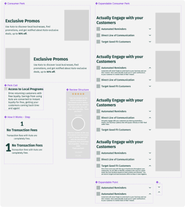
Initial Site Components
Using Figma, I designed reusable UI components that were optimized for both web and mobile, focusing on consistency across pages and flexibility to display different content types. For the components, I wanted to avoid making any section of the website too text heavy and tried to strike the balance between providing information through text and a visual aid.
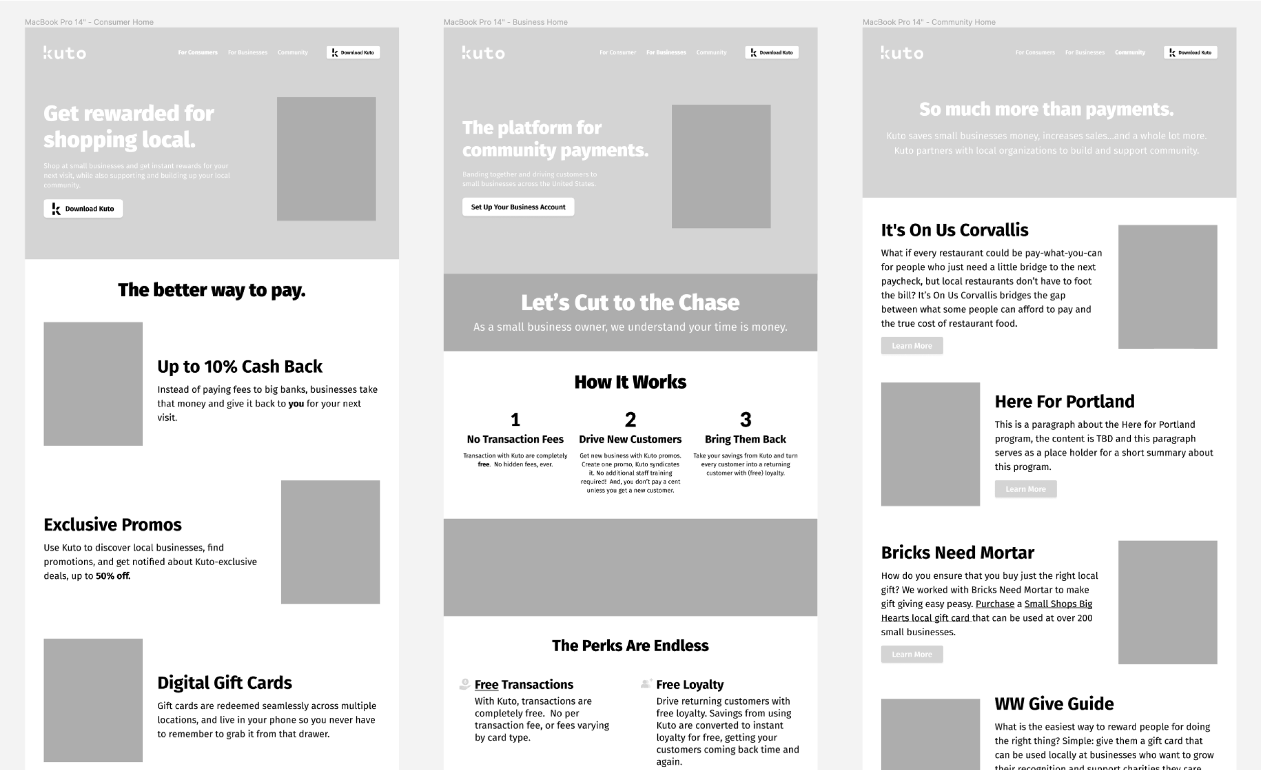
Initial Low Fidelity Prototypes
Going back to my sketchbook, I re-evaluated our features and revised the business page flow to better support Kuto's narrative. By defining the overview, I could further drill down into each idea to create a comprehensive picture of Kuto’s feature set. I finalized the related UI revisions later during high fidelity mocking up.
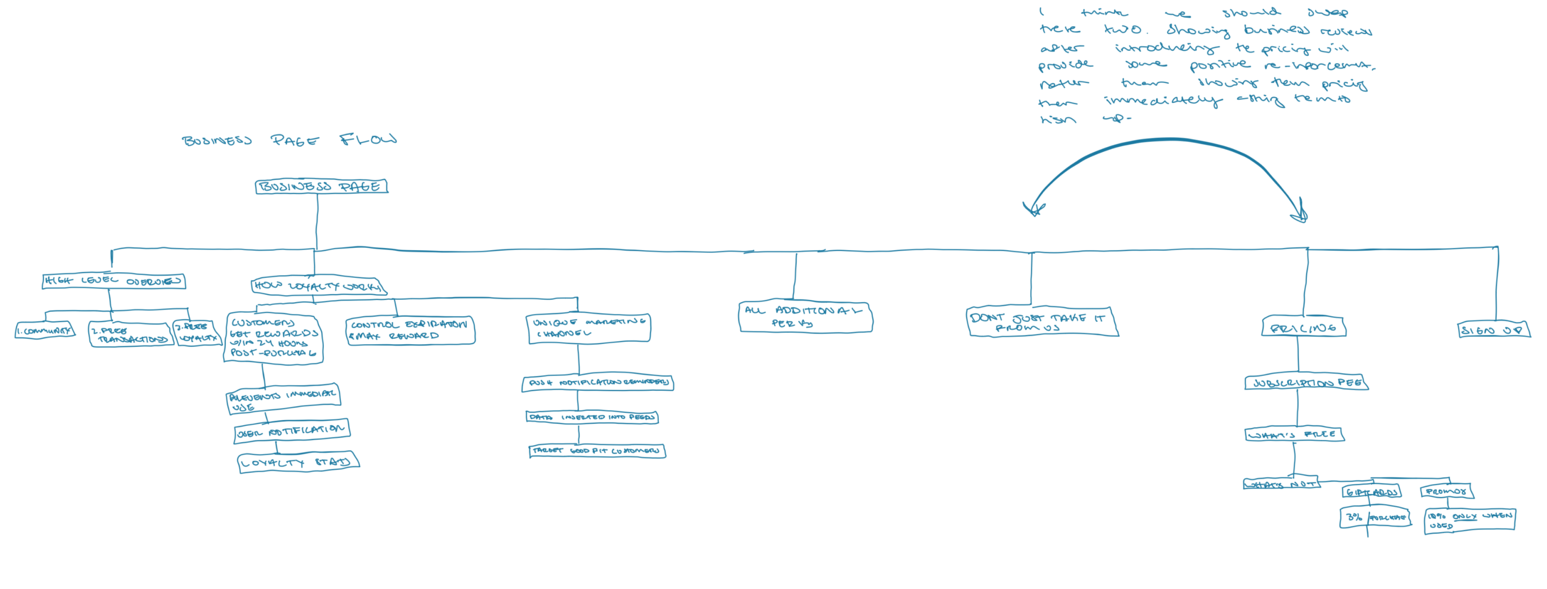
Business Page Flow Revision
High Fidelity Mock Up

High Fidelity Mock Up of Consumer Homepage
In the high fidelity mock up stage, my focus was on refining copy and visuals while maintaining the layouts established in the wireframing phase. The major changes were seen on the business page. Instead of a brief overview of Kuto’s business feature set, I dove further into what makes Kuto such a unique payment platform as well as a detailed breakdown of what sets Kuto’s loyalty program apart.
In addition to the overall business page flow revisions, I also reworked the pricing module to clarify exactly what businesses were getting with their monthly subscription to Kuto.
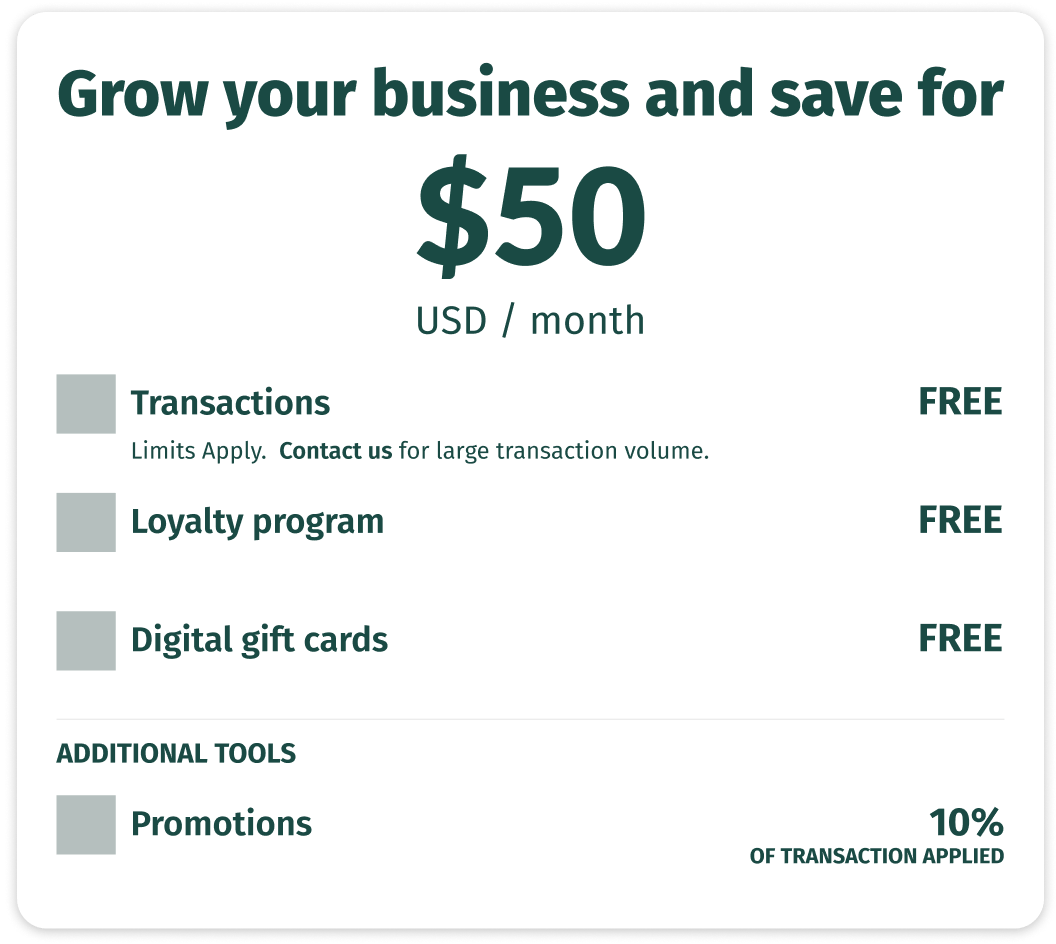
Pricing Module Mock Up
The high fidelity mockups achieved the goals identified in my initial research. For consumers, Kuto's functionality and benefits were clearly presented. For businesses, features were detailed along with transparent pricing. Additionally, through a consistent visual language and layout, I created a clean, uniform UI across the site. I presented the high fidelity mock ups to the team and received overwhelmingly positive feedback, along with a request to build the site immediately given the vast improvement. With an approved design direction and overwhelming team enthusiasm, I proceeded into the actual development of the website.
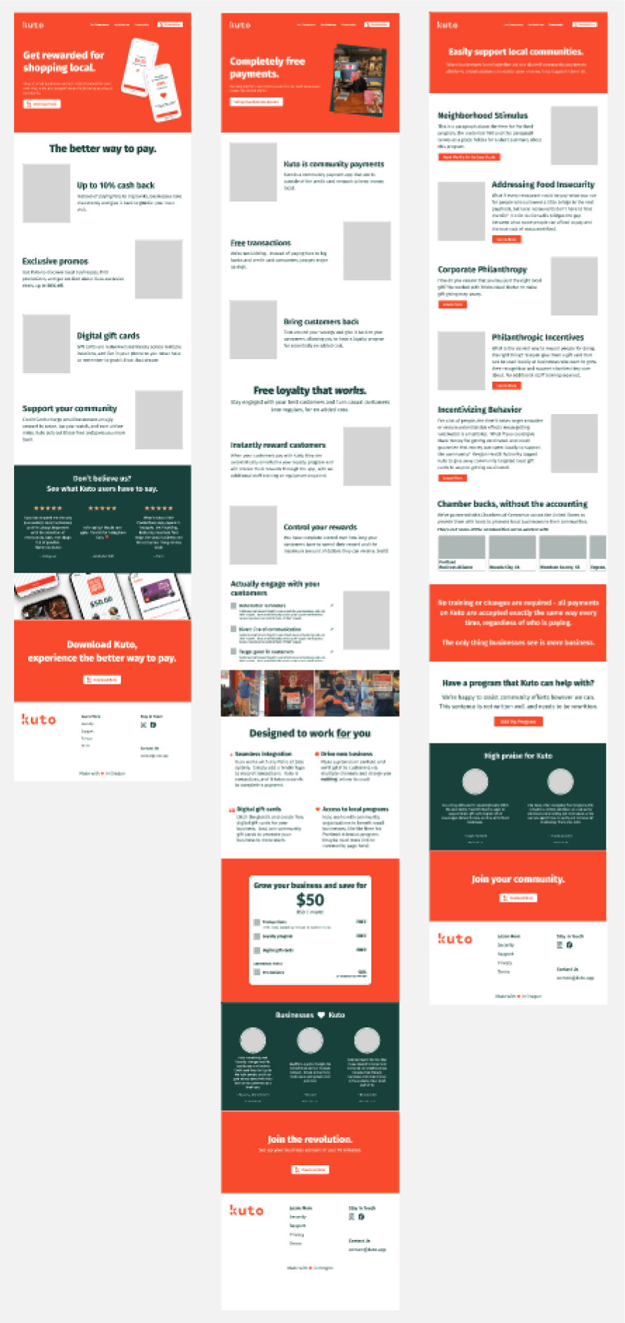
High Fidelity Mock Ups
Development
I broke down the necessary front-end components informed by my high-fidelity mockups. This component architecture allowed iterative development while maintaining connections to the overall UI design system. I leveraged React.js and TypeScript to build out the components, keeping responsive design and accessibility top of mind. Similar to the wireframing process, actual copy and specific graphics were not incorporated until the components were built which allowed me to focus on the technical aspects of the implementation. Adopting a mobile-first approach, I ensured that every component accommodated all screen sizes. Additionally, I ensured that components respected both light and dark mode. Regular testing across a variety of devices and web browsers ensured that I was building an optimized experience.
Final Solution
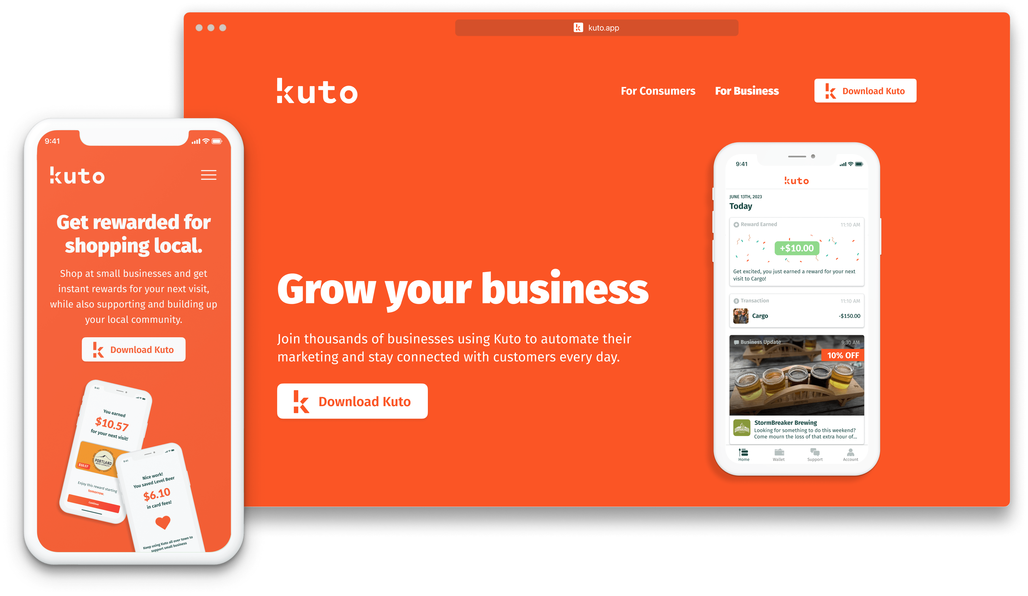
For this redesign, I focused on goals like improving discoverability of key information and communicating our value proposition to both consumers and businesses clearly, which research showed were lacking previously. By simplifying the navigation, highlighting Kuto’s unique features, and crafting a compelling story in the new iteration of the website, these goals were achieved.
The best way to experience the final product is to visit the website at www.kuto.app. Copy may have been modified since final solution was pushed out.
Results and Takeaways
Once the website went live, we immediately saw positive results. When the sales team reached out to businesses and sent them our website link for review, the response was drastically different and businesses were much more eager to meet with sales to discuss further details to sign up. I am very proud of this project and the positive results it yielded for the company. It was a challenge to be solely responsible for every phase of this project rather than working collaboratively with other members who were also involved in the initiative, especially given the timeline. Quickly learning improved project management skills and breaking the project down into manageable chunks with appropriate timelines enabled me to stay focused on the phase I was currently working on as well as on track for project completion. I also enjoyed being able to involve the design-thinking process and empathetic lens used in UX design in the development process for this project.