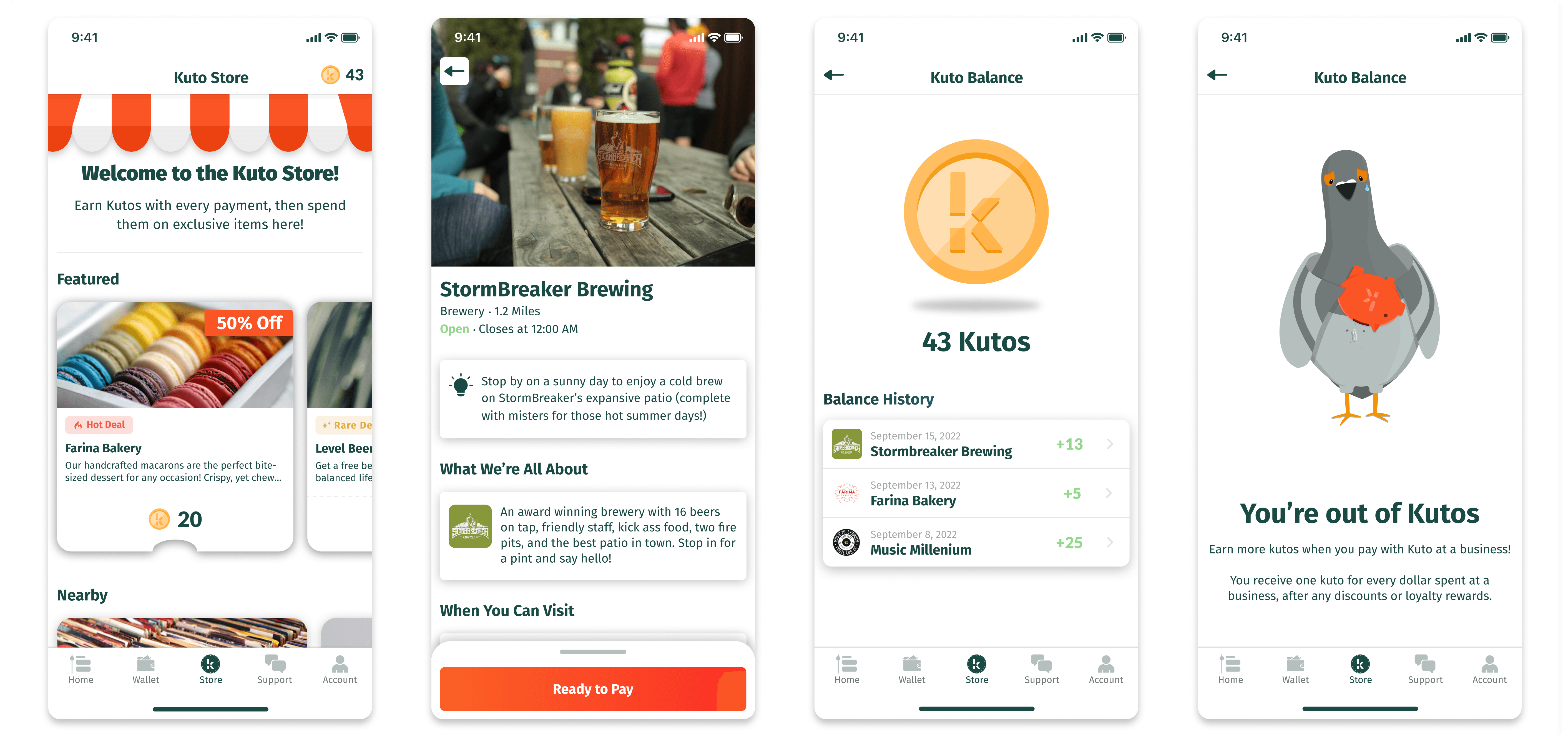
Kuto Store
Problem
Kuto, an app designed to cut expensive bank fees for small businesses, has clear benefits for business owners. However, the advantages for consumers were less apparent. Consumer users initially enjoyed paying with Kuto, knowing they were supporting their community, but found little motivation to continue using it long-term when credit cards offered more tangible rewards like airline miles or cashback. While Kuto resonated with consumers' altruistic desires initially, it did not provide enough ongoing incentive to change engrained payment habits focused on maximizing personal rewards.
How might we promote ongoing Kuto usage that mutually benefits small businesses and their loyal customers?
Solution
To incentivize continued app usage and support for local businesses, I designed the Kuto Store, an in-app destination where users could redeem exclusive deals and promotions from community retailers using Kutos, a points currency earned from paying with Kuto. The Kuto Store created a positive feedback loop - consumers were motivated to frequently pay with Kuto to earn more points to redeem deals, while local businesses gained new customer traffic. This gamified loyalty program aimed to drive habitual engagement with Kuto as both a payment method and a channel for discovering local offerings.
As the sole designer at Kuto, I was responsible for the research, design, and evaluation of the Kuto store.
ROLE
TOOLS
CLIENT
The Approach
The project was organized into three phases:

With a team of just myself as the sole designer and one engineer, and limited funding runway, I needed to effectively execute the design portion of project in a condensed timeframe. This required moving rapidly from research into design and development. While engineering began building the new features, I worked closely with them to create an iterative design process where we could conduct user testing and refine the product concurrently.
Research
To begin the research phase, my goal was to explore potential features that could increase user engagement within Kuto and promote local businesses. My process included analyzing user session data and app usage, interviewing business owners about their promotional needs and experiences, and conducting a competitive analysis of similar rewards platforms.
User Session and App Data Analysis
By reviewing user session recordings, my goal was to understand engagement levels and identify issues in the user journey. I found that most sessions were purely transactional - users only opened the app to make purchases, with minimal exploration. More concerning, analysis showed users frequently clicked retailer links that led out of the app, indicating insufficient in-app business information. These behaviors demonstrated a clear need for more explorable and engaging content beyond transactions. For example, we briefly experimented with showing users promotional deals from nearby businesses post-purchase to encourage further exploration. However, we found poor opt-in rates, likely due to the pressure of choosing a deal during the transaction process. Additionally, the niche deals shown were often a poor match for the user's interests. That said, users who did claim deals typically used them at new businesses, indicating our presentation and targeting of deals needed refinement. While imperfect, this initial experiment highlighted clear opportunities to explore alternative solutions to better engage users through deal promotion and recommendations.
Business Interviews
The goal of conducting business owner interviews was to understand perspectives on existing promotional programs and pain points. Key themes that emerged were high fees associated with many third-party promotion programs that hurt profitability. Additionally, owners expressed uncertainty whether current promotions actually helped acquire new customers.
Competitive Analysis
I conducted competitive analysis to see to how other coupon platforms engage consumers and businesses in order to understand what attracts and deters them from these services.
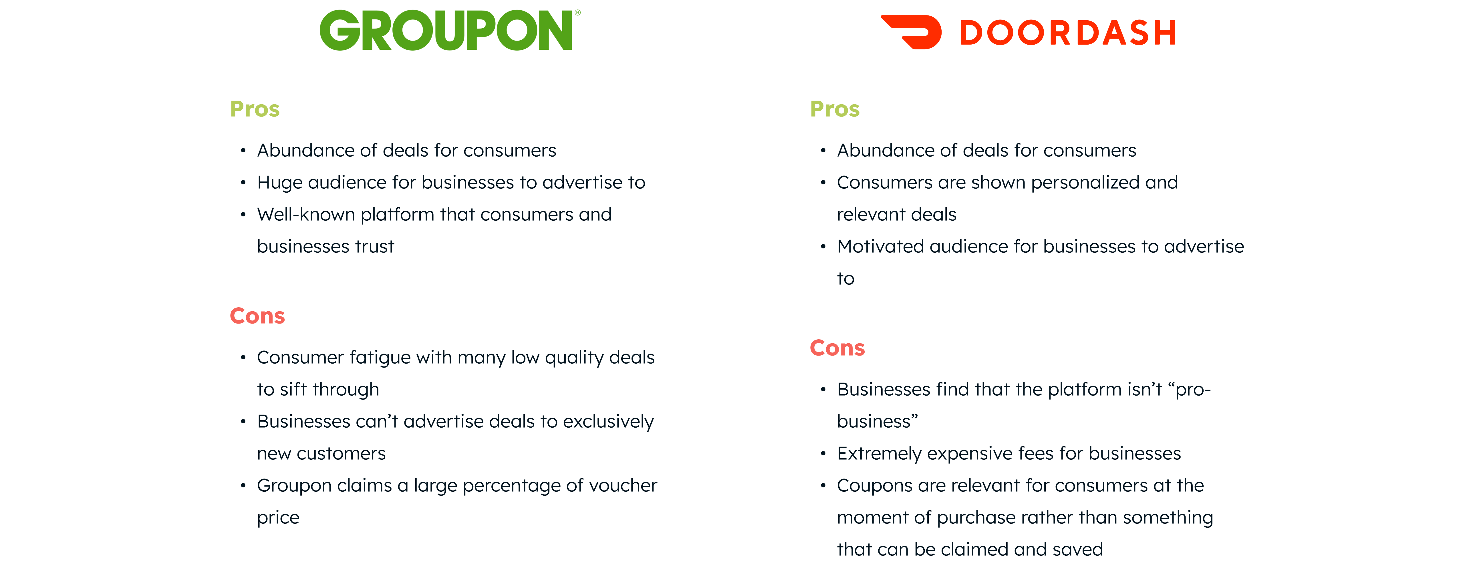
Findings
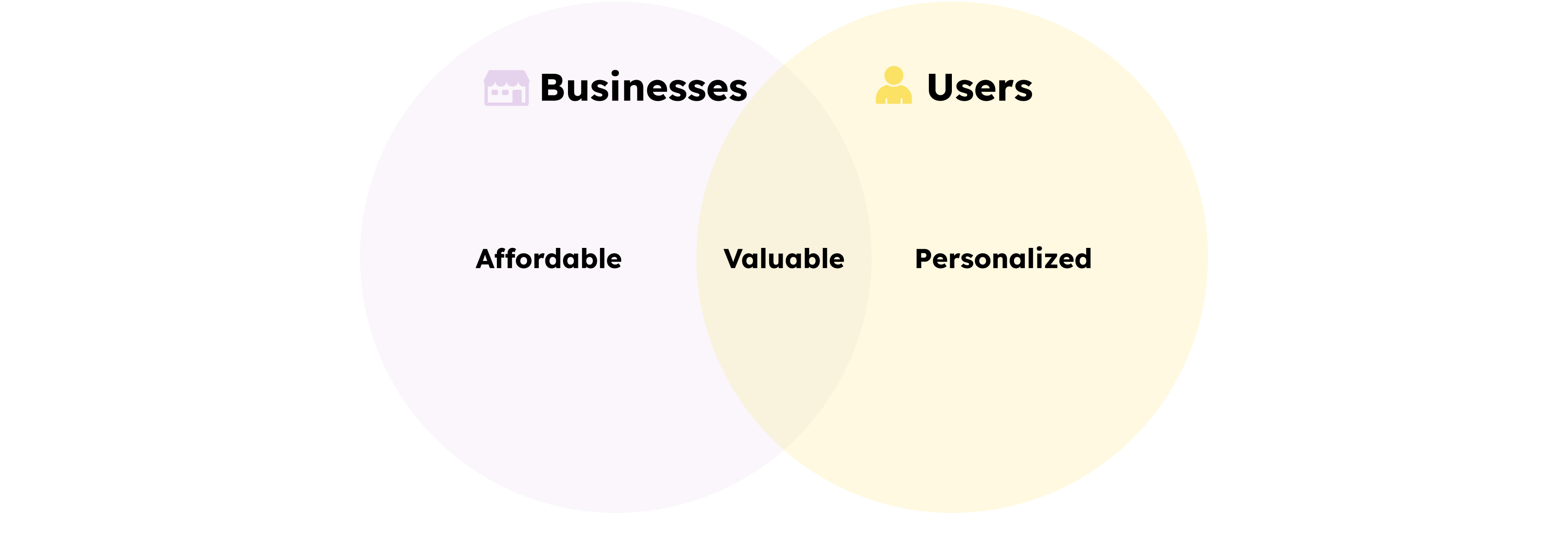
After initial research, I distilled the findings into three core goals for the feature:
- Affordable for businesses - deals need to have low fees to incentivize participation
- Valuable for businesses and consumers - drive new customer acquisition rather than only rewarding loyal users and showcase appealing, high quality deals for users
- Personalized for consumers - tailored, appealing deals that motivate engagement
Design
I conducted competitive analysis to see to how other coupon platforms engage consumers and businesses in order to understand what attracts and deters them from these services.
User Flows
To inform my UI designs for the Kuto Store, I first documented the user flow starting from the receiving of Kutos after a purchase. Mapping the flow revealed insights like different possible store states and key screens missing from the experience. Ultimately, this process allowed me to identify all of the necessary screens to design.
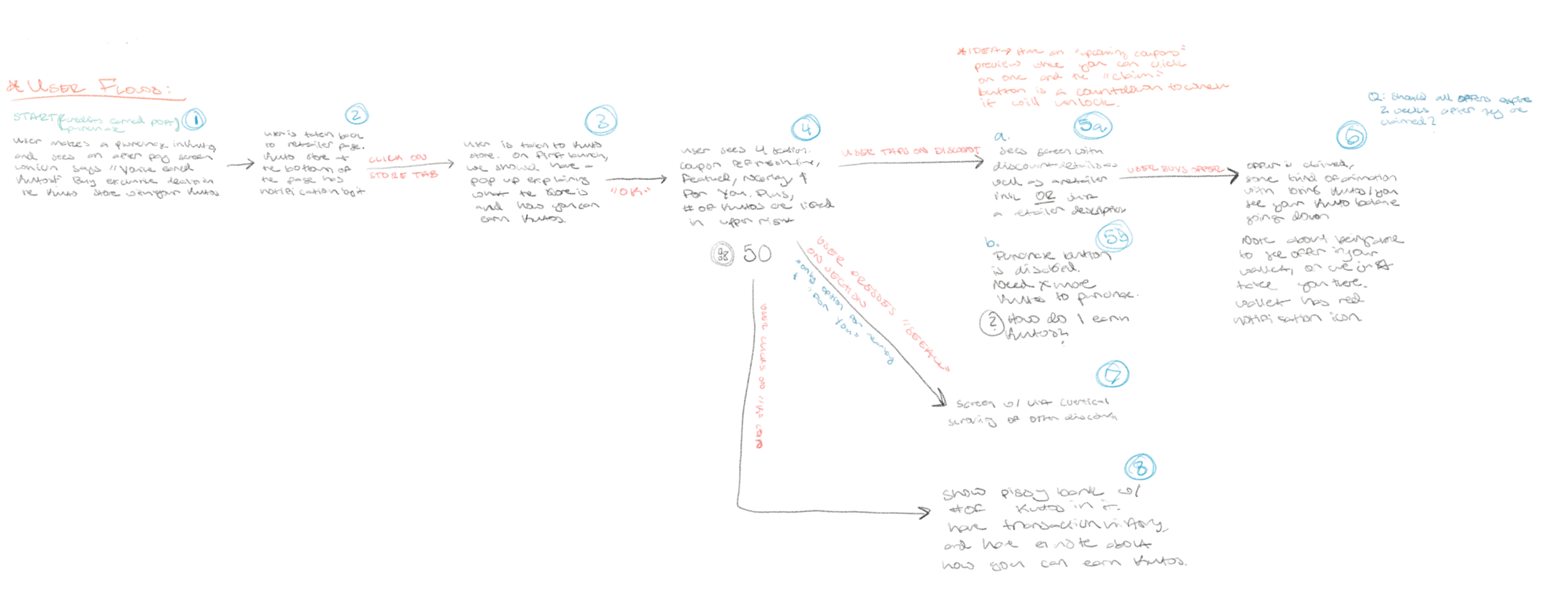
User Flow Map
While designing the new Kuto Store experience, it became clear that the existing retailer pages in the app needed an overhaul. These pages only displayed minimal information and imagery for each business. Through user feedback and complaints, we recognized that this lack of detailed business information was a major issue. Users would often leave the Kuto app to search for more details on Google Maps, frequently abandoning their journey in Kuto.
This presented a significant obstacle to the success of the Kuto Store. For users to feel compelled to spend their Kutos on deals for unfamiliar businesses, they would first need to learn about that business through an engaging profile.
To address this issue, I made redesigning the retailer profile pages a priority. My goal was to provide a robust profile for each business that would inform users and build excitement for deals.
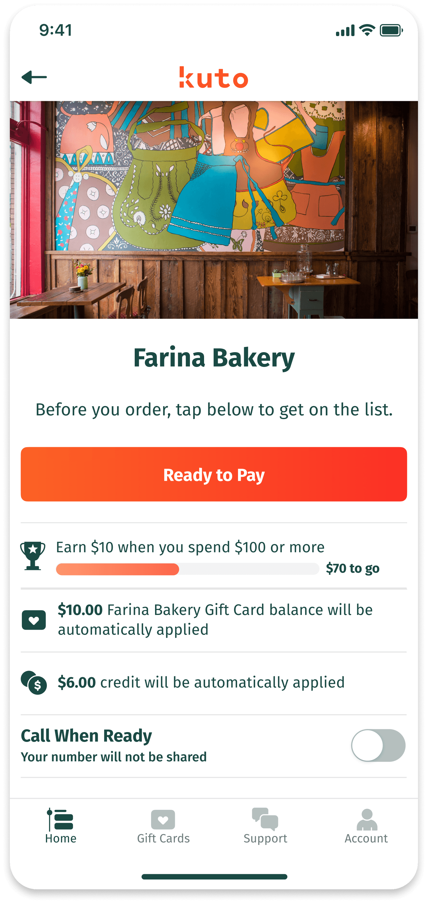
Original Retailer Page
Wireframes
Kuto Store
The goal for the Kuto Store interface was to showcase deals in a compelling yet simple way. The ideal vision was to recommend deals tailored to each user based on their purchase history and habits. However, developing a robust recommendation algorithm was not feasible within project scope and timeline.
With this in mind, I sketched concepts for a straightforward store layout organized into three main deal categories: Featured, Nearby and For You. This simple structure could easily be built within MVP constraints while still adding value for users.
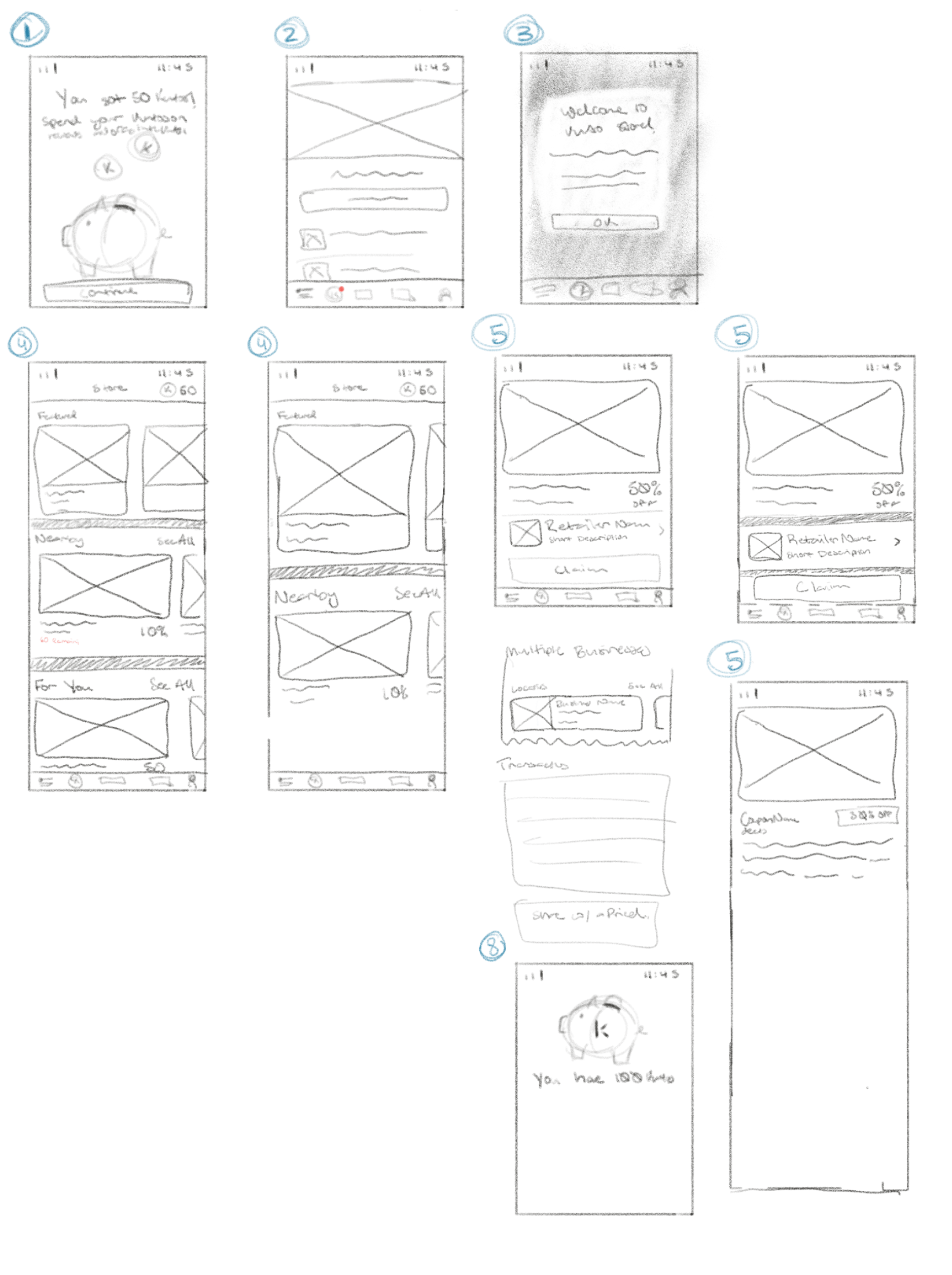
Kuto Store Layout Sketches
Deals
My goal was to design compelling store deals that motivated purchases. However, Kuto's lack of integration with retailer inventory systems posed a constraint - deals could only provide discounts off total purchase amounts, not free specific items. Prior experiments showed users preferred offers for free items compared to percentage or dollar discounts. With this in mind, I sought to create a design with descriptive deal titles that grabbed attention while also clearly communicating the discount value to ensure transparency.
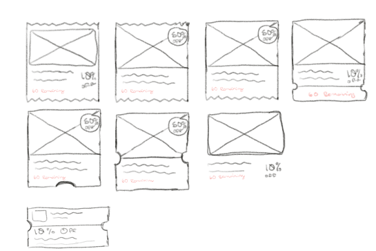
Discount Sketches
Retailer Page 2.0
A key issue discovered was the need for more robust business profiles within the app. The original minimalist retailer pages did not provide enough information for users to learn about and engage with businesses. To address this, I developed a new page structure centered around telling an engaging ‘business story’. This included details like photos, menus, and gift cards to create a profile similar to what a user might find on Instagram or Google Maps. Prominently featuring these profiles solved two major problems - reducing users leaving the app to search elsewhere, and surfacing obscure but valuable features like menu hosting.
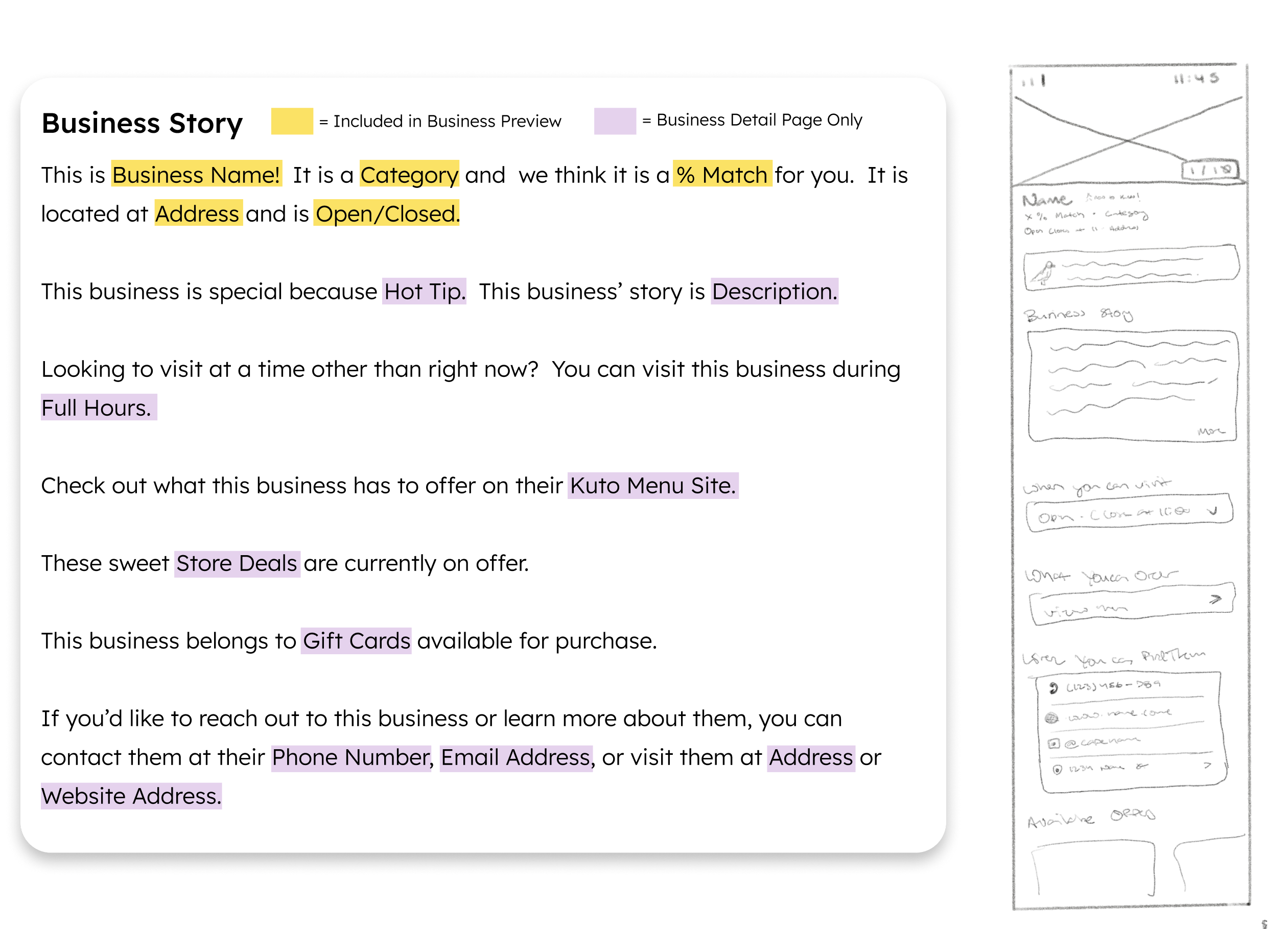
Business Story and Retailer Page 2.0 Sketch
I also redesigned the placement and prominence of the Ready to Pay button. Since payment was the primary action on the page, it needed to be prominently featured and easily accessible. I moved the Ready to Pay button and wallet details to a bottom sheet that automatically surfaced when users checked in.
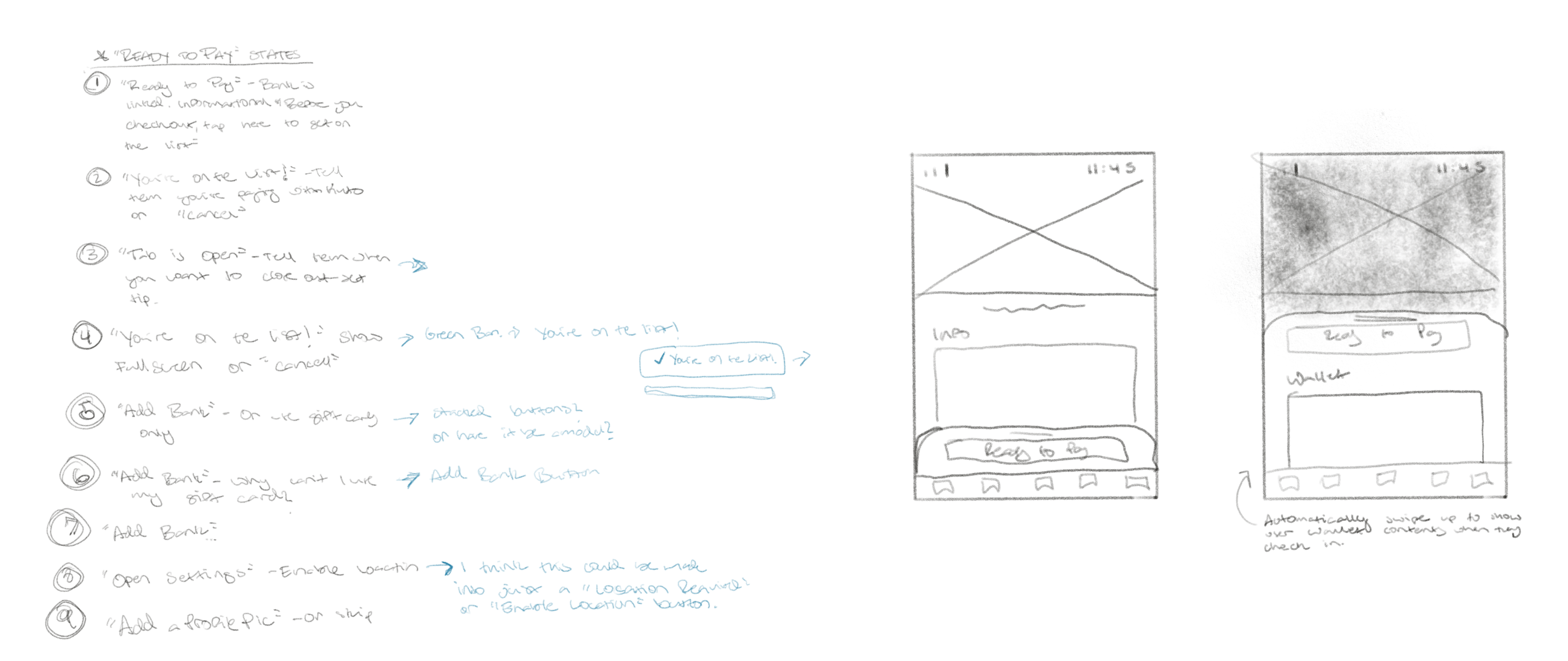
“Ready to Pay” Button States and Bottom Sheet Sketches
High Fidelity Prototypes

High Fidelity Mock Ups
The high fidelity mock ups visually refined the wireframes but maintained the same layouts and information architecture.
An additional requirement emerged during high-fidelity mockup development - the Kuto Store needed to offer discounted gift cards for purchase in addition to Kuto-only discounts. This added complexity, as gift cards would require both Kutos and US dollar currency compared to Kuto discounts which only used rewards currency. Accommodating both payment and offer types required iterations to the simplified deal designs developed during wireframing.
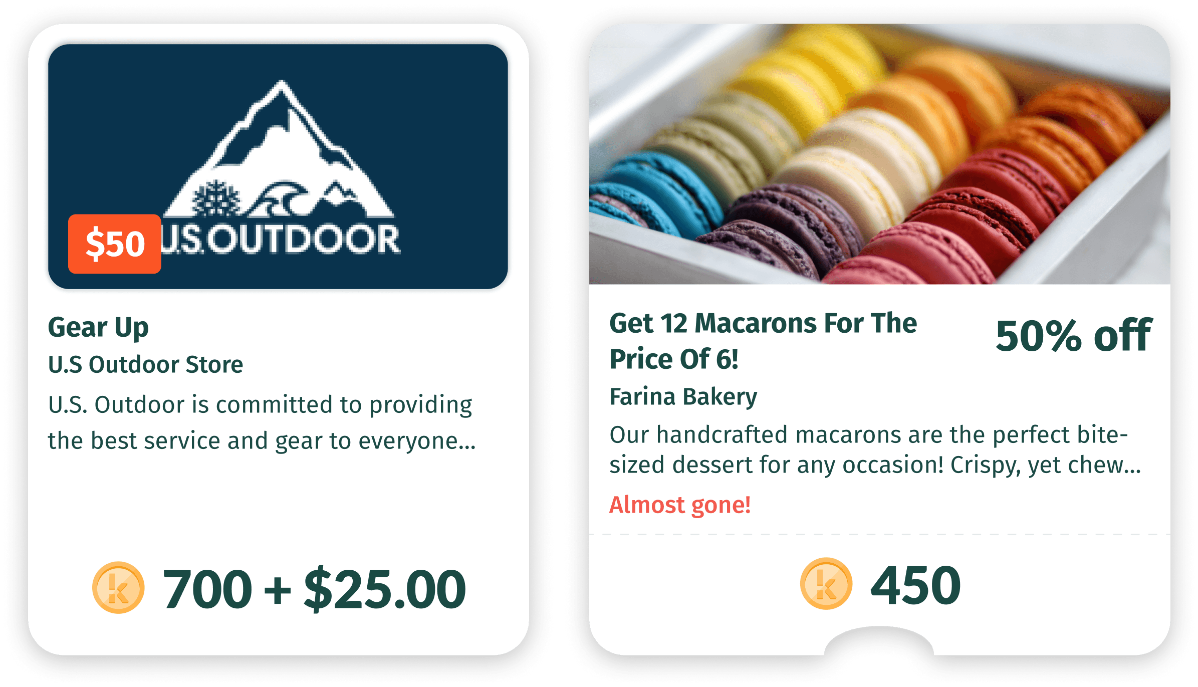
Discounted Gift Card Deal and Basic Promo Mock Up
Usability Testing
Target Testers
To evaluate the usability and appeal of the new Kuto store, I conducted remote moderated user testing sessions via Zoom. The goal was to include a mix of our organic users (who signed up on their own) and gift card users (who received a $50 credit). I was able to target recruitment by posting an in-app banner calling for testers. From the responses, I selected 5 participants with varying levels of existing engagement based on their purchase history in the app. The final test group included both organic and gift card users with both more and less active usage.
Testing Goals and Tasks
My goal for usability testing was to evaluate the new Kuto Store and reward features before launch. Key questions I wanted to answer included:
- How do users respond to receiving Kutos rewards after purchase?
- Do they understand how to redeem them?
- Are the new store deals and offers intuitive and enticing enough to encourage engagement?
To assess this, I developed a series of moderated tasks where users would simulate making a restaurant purchase, receiving Kutos, and then browsing the store deals. Since personal interests vary, I asked testers to adopt a common set of interests when evaluating store appeal.
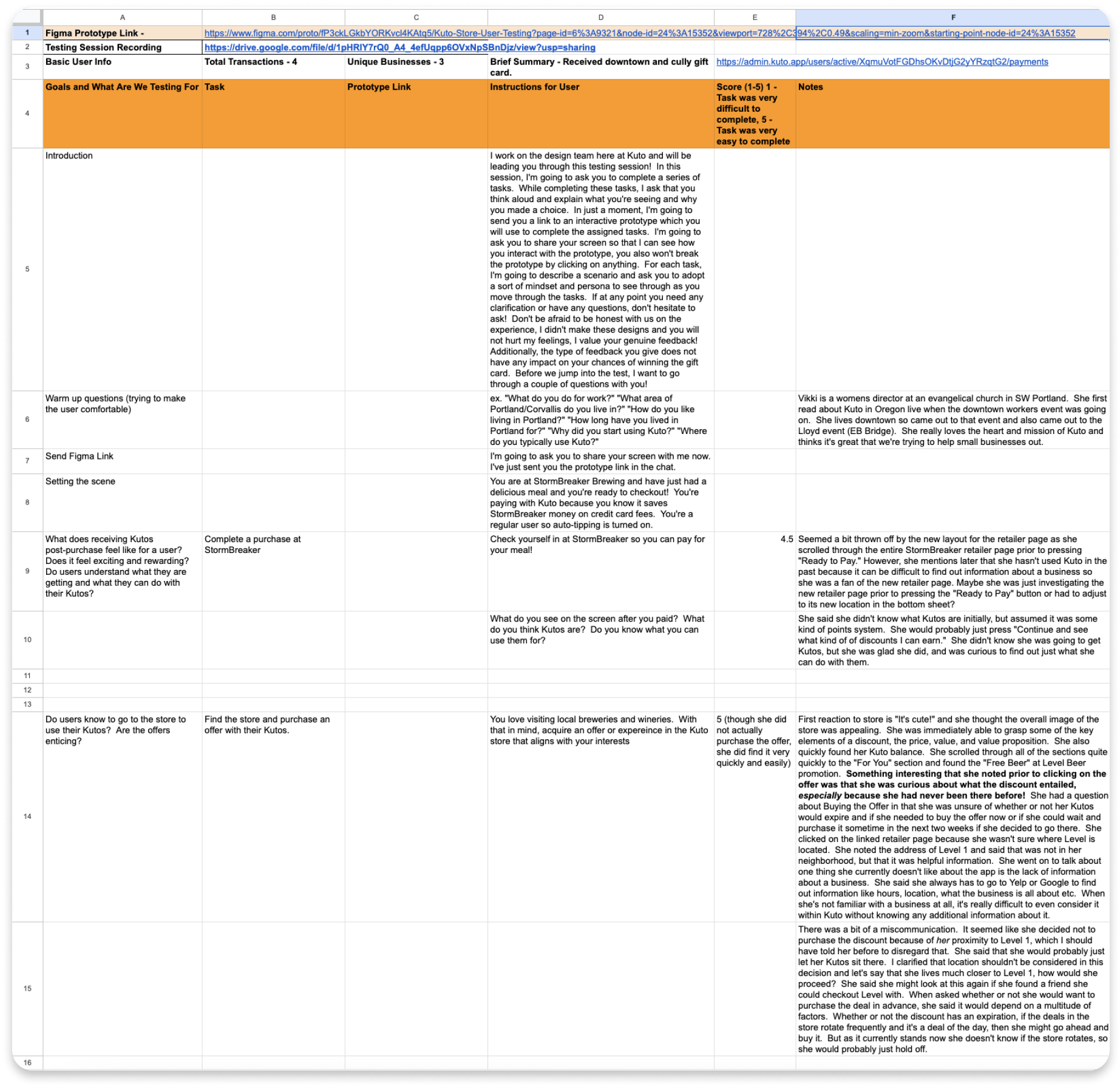
User Testing Script, Tasks, and Score Sheet
Results
The key finding from usability tests was the need for urgency to motivate store purchases. Users were hesitant to spend their Kutos without scarcity pressure. Rather than browse and make impulse buys, they preferred to wait and see if deals could be used at planned visits.
The key finding from usability tests was the need for urgency to motivate store purchases. Users were hesitant to spend their Kutos without scarcity pressure. Rather than browse and make impulse buys, they preferred to wait and see if deals could be used at planned visits.
Additionally, some users were confused by the combination of descriptive deal titles and actual discount values. To make the deals clear, I eliminated descriptive titles in favor of just the business name and made the discount value more prominent.
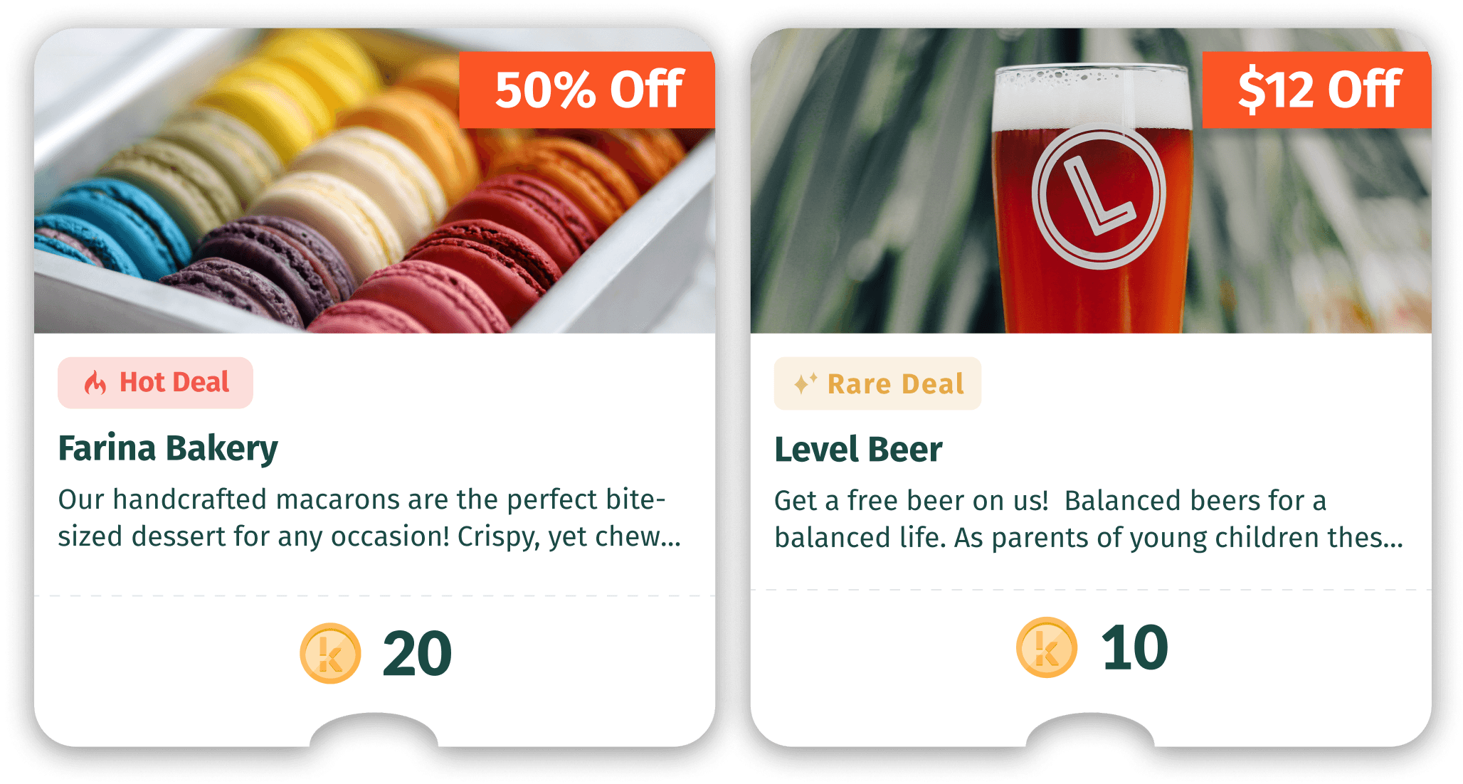
Updated Promo Mocks with Tags
Final Solution
The user testing revealed the need for urgent calls-to-action and clarity around deal values, which informed final design modifications. However, we found the store's success depended more on deal quality, relevance and location proximity. With those needs in mind, we focused on gathering a wide selection of discounted deals from local businesses around anticipated areas of interest. Additionally, some minor changes were made to draw attention to the deal value. This compiled research led to a polished, launch-ready Kuto Store.
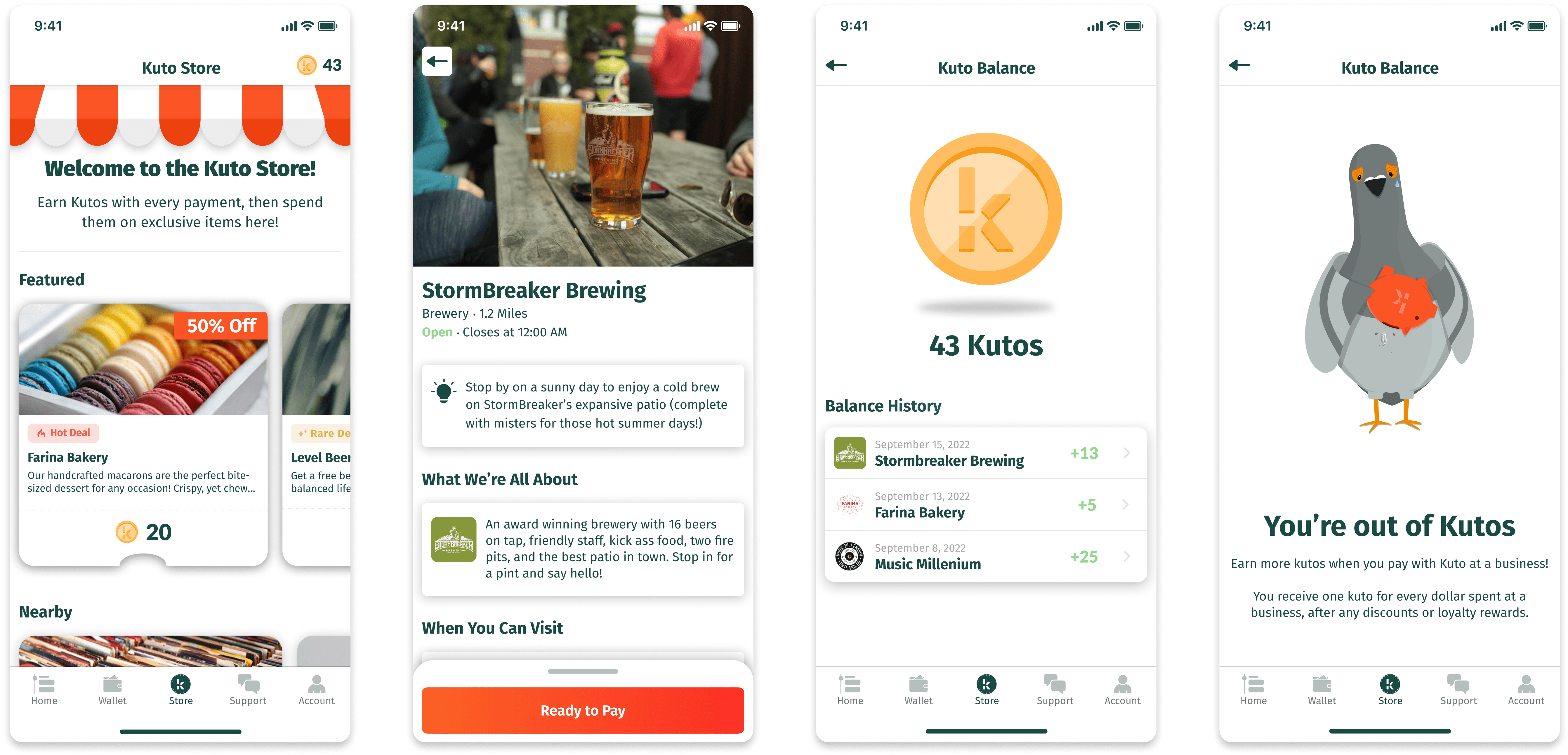
Final Mock Ups
Results and Takeaways
The Kuto Store saw strong initial usage demonstrating appeal of the concept, but scaling it long-term posed challenges without content automation. Though currently inactive, this first iteration provided valuable insights to guide future attempts at launching similar features. While the core concept of incentivizing local discovery remains promising, key learnings emerged.
As the lead designer, I gained crucial experience advocating for sufficient user validation despite startup pressures to launch quickly. In a fast-paced environment, I would take steps earlier to assess technical feasibility, start with smaller feature scopes, and align more closely with engineering. Discussing recommendation automation feasibility sooner could have revealed the need for a more incremental roadmap.